On press
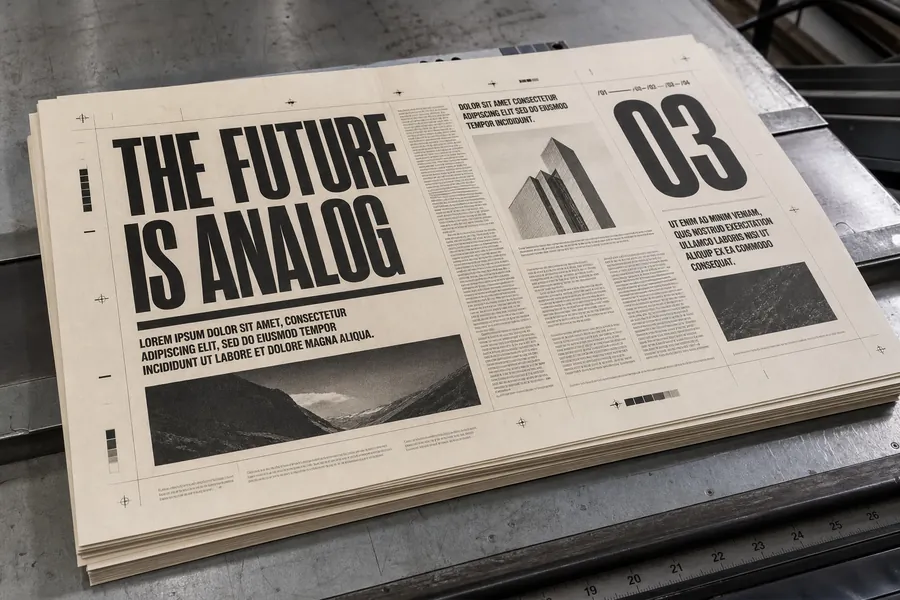
The press sheet
Inspects an image collection with zoom, navigation, and a native dialog lightbox.

Image caption
The press sheet
Three ways in. They share one source, so the pixels match whichever you pick.
npm install @noorddev/vlak-react

// once, next to your app's root
import "@noorddev/vlak-react/css";

import { ImageViewer } from "@noorddev/vlak-react";
Precompiled React and one stylesheet. No compiler to configure. Per-component imports work too: @noorddev/vlak-react/components/image-viewer.
npx @noorddev/vlak-cli add image-viewer
The StyleX leaf lands in components/vlak/ with its dependencies, for your own compiler to own. See StyleX.
npx shadcn add https://vlak.dev/r/image-viewer.json
The same registry item, installed by shadcn's CLI.
<link rel="stylesheet" href="node_modules/@noorddev/vlak/css/vlak.css" />
No React. Link vlak.css and use the markup and classes below.
import { ImageViewer } from "@noorddev/vlak-react";

<ImageViewer images={[{ src: "/front.jpg", alt: "Front cover", caption: "Front cover" }, { src: "/back.jpg", alt: "Back cover", caption: "Back cover" }]} />Inspect a labelled image collection inline or in a native lightbox.
| Prop | Type | Default | Description |
|---|---|---|---|
imagesrequired | readonly ViewerImage[] | ||
value | number | ||
defaultValue | number | 0 | |
onValueChange | (index: number) => void | ||
label | string | "Image viewer" |
Also accepts Omit<HTMLAttributes<HTMLDivElement>, "defaultValue">.
| Keys | Does |
|---|---|
| Arrow left, Arrow right | Changes images when the image canvas is focused. |
| Tab, Enter, Space | Operates image navigation and zoom controls. |
| Escape | Closes the native lightbox and returns focus to its opener. |
<div class="rs-image-viewer" role="region" aria-label="Image viewer"><div class="rs-image-viewer-canvas"><img class="rs-image-viewer-image" src="image.jpg" alt="Describe the image" /></div><p class="rs-image-viewer-caption">Image caption</p></div>